Microsoft Office 2013 is Here!
For those who have been busy moving to the Cloud, you may of not noticed that Microsoft has released a new installment of their Office software bundle. Microsoft Office 2013 has launched and it brings to the table a new look and feel to bring it in line with the Windows 8 branding.
Along with a new look and feel, Office 2013 is bringing a touch of the cloud to the long running software bundle. Along with a cloud influence, Office 2013 brings a bunch of new features, notably to do with the “preview” modes of Word and Powerpoint.
I must admit I’ve always been a little obsessed with upgrades that improve the GUI and give a fresh look. So I was excited to install Office 2013 to give it a whirl.
I will be running through some of the visual changes, as well as a quick sneak peek at some of the new features.
With the launch of Windows 8, Microsoft have brought a new look and feel to their operating system. To bring Office up to speed Office 2013 has been given a face lift. They have kept the same “ribbon” menu as was introduced in Office 2010, however with a few minor changes.
Office includes a large number of applications that make up the bundle, in this blog I will be just reviewing the cores applications that come with Office 2013, including Outlook, Word, Excel and Powerpoint. Below is a sneak peek at the new icons Office 2013 is flashing around,
![]()
Outlook 2013
Outlook has not changed dramatically which is a good thing I believe. The GUI interface has been given some tweaks here and there, but overall the functionality is still there, and if you are used to Outlook 2010, then you should not have any major issues migrating across.
Outlook 2013 has been brought up to speed and given a new look and feel.
The default theme is a lighter grey and white theme with blue highlights for any select items. Take a look below,
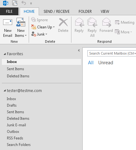
The bottom area of the Outlook interface has changed slightly too with the “Mail, Calendar, Contacts, Task” buttons being moved a little. See the example below,

In my opinion this is an improvement on the previous versions. The left menu get’s some space reclaimed and I find the colour scheme a lot easier to read from.
There are a range of visual improvements to Outlook, mostly minor. However the final product is well worth a review.
One key feature is full support for synchronizing with our Outlook.com our Hotmail.com email account.
The calendar area has also been revamped with some visual improvements, I personally have started using the calendar a lot more since.
Word 2013
Word has been given a make over and noticeably a new start page. The start page is where you select if you wish to open a new document, recent document or possibly use a template. If you look below you will see the new start page,
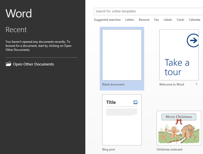
As you can see it has got a clean new look in line with Windows 8’s metro feel. I personally like it, and think the simpler approach is a step in the right direction.
Along with a new start page, the ribbon menu when working on a document has been flattened and given a tweak or two, as seen below. I’d be interested to know what other people think about this new look. Feel free to leave a comment.
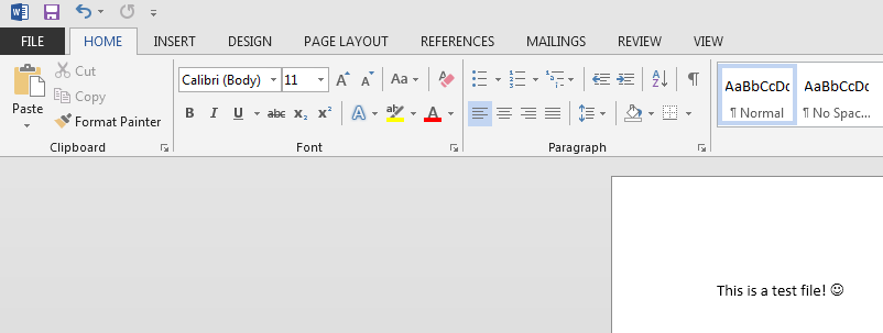
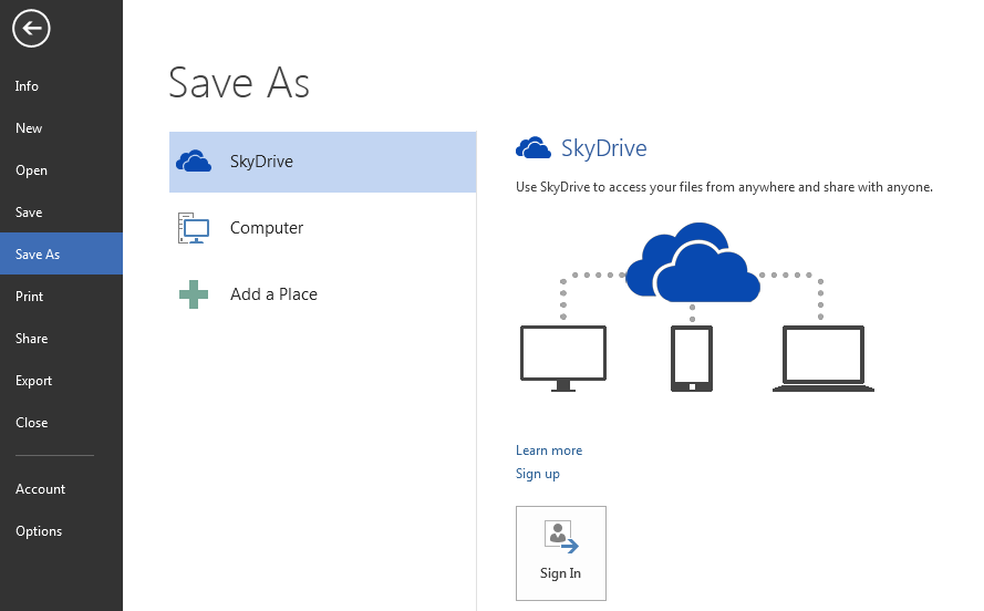
Two new features in Word is the ability to save directly to your SkyDrive account, and a simpler “Reading mode”.
The sky drive feature is primarily noticed when trying to save a new document. You are greeted with an option to choose your Sky Drive account and sign in.
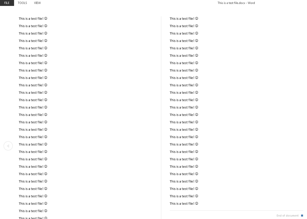
Another great feature is the Reading mode, when viewing documents you are not editing, Word has a cutdown version that basically only shows the document and not the ribbon menu, almost like a full screen mod. A preview can be seen below,
Excel 2013
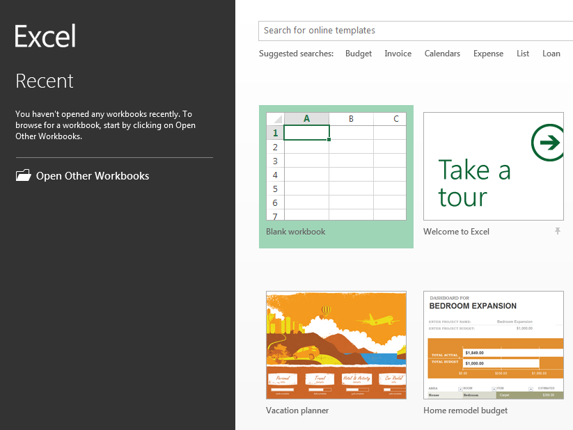
Excel also got a tweak in its look and feel. The main changes are a new start page. Similar to Word, the new start page gives you a new interface for choosing if you wish to open an existing spreadsheet or start fresh. An example of the start page is below,
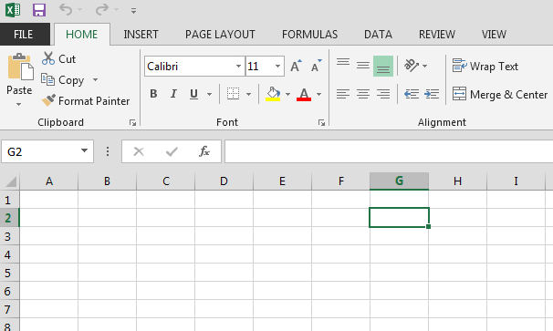
The main UI when editing a spreadsheet has been tweak and includes the flattened / tweaked ribbon UI. A sneak peek below,
Powerpoint 2013
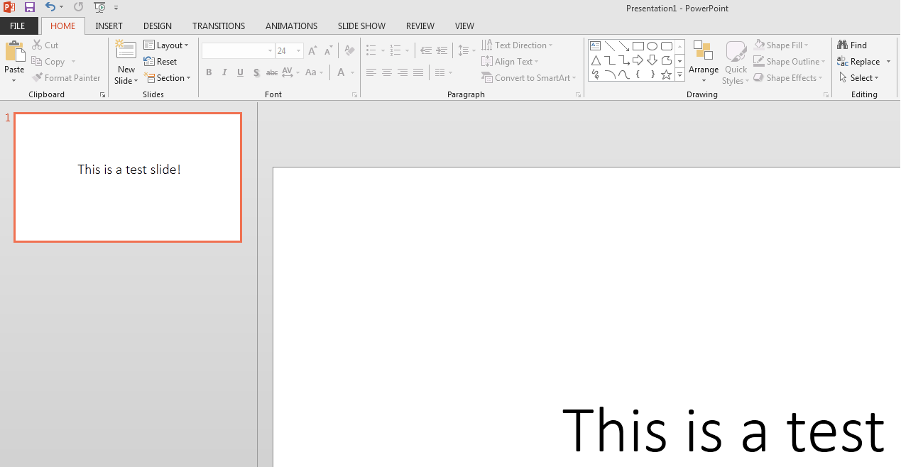
PowerPoint has also been given an overhaul in the GUI department. Along with a new start page, it has also got a tweaked UI. The UI can be seen below,
Conclusion
I have been using Office 2013 for about 1 month now and whilst I only heavily use Outlook and Word, I have found both applications to be much more responsive than their successors in Office 2010.
It is worth mentioning that I did an upgrade, so I installed and upgraded from my Office 2010 installation. I was concerned about the upgrade process of my Outlook profile to Outlook 2013.
When I started Outlook 2013 for the first time, it let me know it was upgrading my PST files (the place all my emails are stored) and spend the next few hours working in the background upgrading everything. During that time I was still able to receive new email and so forth. No drama!
Overall I think the visual improvements are step in the right direction. My next plan is to install a fresh Windows 8, along with a new install of Office 2013 and have it all working in harmony (well that is the plan).
I would love to hear any comments or feedback you have about your experience with Office 2013, feel free to leave a comment or two.
| Hosting Options & Info | VPS | Web Solutions & Services |
|---|---|---|
