What Happens After Getting to Page One?
Today’s article will be targeting one of the biggest misconceptions and paradigms about SEO and Online Marketing.
What happens beyond SEO and once a website gets onto the notorious page 1, does the journey stop there? Me thinks not!
Ironically enough, page 1 is really the start of the journey. What happens from this point is what will determine the amount of ROI you make from your online spend and how far your business goes. Certainly being higher up on page 1 will mean more visitors and higher click through rates but this does not necessarily mean more business.
Today we will be giving a sneak peak into one of the main topic areas we will be discussing at our Crucial Connect event. Conversion rate optimisation and how implementing this can double or triple your sales with the same traffic.
Conversion Rate Optimisation and UX/UI
Conversion rate optimisation and split testing is a hugely overlooked process by most SMB businesses. Conversion rate optimisation is the process of programmatically and systematically testing the different user experience and user interface elements of your website with the end game of encouraging more conversions!
This is a commonly overlooked element of most marketing and digital campaigns. Below we are exploring a case study of a SMB client of The Online Marketing Gurus who underwent CRO/UX testing.
The Case Study
The background:
- This website had been doing SEO for 6 months and was averaging 450-500 visitors a month
- The site ranked on the top 5 spots for all major keywords “Plumber”, “Plumbers”, “Plumber Sydney”
- We identified a high bounce rate on the website as well as visitors dropping off on the homepage
The test:
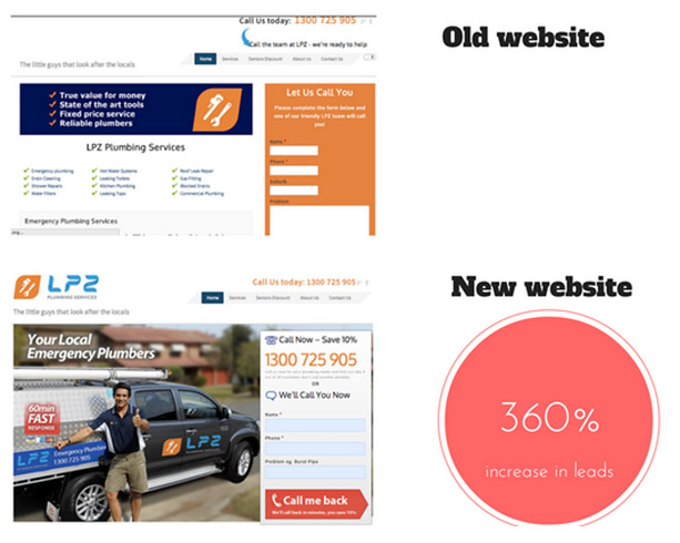
- The Online Marketing Gurus ran a test optimizing the site with a new high impact contact box on every page
- We made call to actions more prominent on homepage (phone numbers and contact boxes)
- We added “trust elements” such as including pictures of the team, across all service pages on the site.
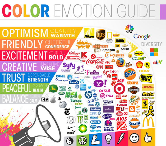
- We used best practices in terms of color and emotional triggers to move people through the buyers process on the site.

Source: http://www.bitrebels.com/wp-content/uploads/2013/01/color-emotion-guide-logo-infographic.jpg
- We identified that the biggest buyers issue with Plumbers was trust so we made the more prominent color of blue available on the site in call to action boxes and copy.
- We used red colors for calls to action to boxes to entice action.
The results:

- Uplift in leads by 360% (3-4 leads a day to average of 12, and peak of 25 leads a day)
- Traffic remained consistent and in fact DROPPED but leads increased
- 3 x sales increase
What else will we be covering at our Crucial Connect event?
- 80% of deals are closed on the 5th contact, but 80% of salespeople don’t contact people more than twice…is your website the scared sales person?
- How you can use email Marketing & Content Marketing to stay top of mind.
I look forward to seeing you there!
